
Although we generally tend to think of interior design in terms of aesthetics, there’s a lot more going on behind the scenes than you might think. Interior design in the home is known to contribute to your mood and wellbeing. For example, if you live in an environment with dark walls, no light, and little fresh air, it’s unlikely you’ll thrive mentally. Cruise ship interior designs are in no way exempt from these rules, although as always there are special factors that must be accounted for (for example, the color green doesn’t quite serve as the same calming color it might do on land…). One of the designer’s key tasks and responsibilities is to ensure the interiors of the cruise ship positively contribute to each guest’s mood. When someone enters a restaurant, you might want them to feel hungry, meanwhile, when a guest visits a spa, you’d want them to feel relaxed. But how can these feelings be achieved through interior design?
Luckily, the psychology of interior design is generally well-covered during aspiring designers’ extensive training. As such, cruise design studios are experts in manipulating the guest’s emotions to ensure the best experience possible while travelling.
The core principles of design include balance, proportion, symmetry, and rhythm. Executing each one successfully brings harmony to a space and can help to improve an interior’s emotional quality. But through which methods are these achieved? Space, color, light, and texture all come together to form a cohesive work of interior design. But each aspect has its own variables that could alter a guest’s mood.
Read on to discover the ins and outs of interior design psychology, plus some top tips for cohesive design and color picking.

Space
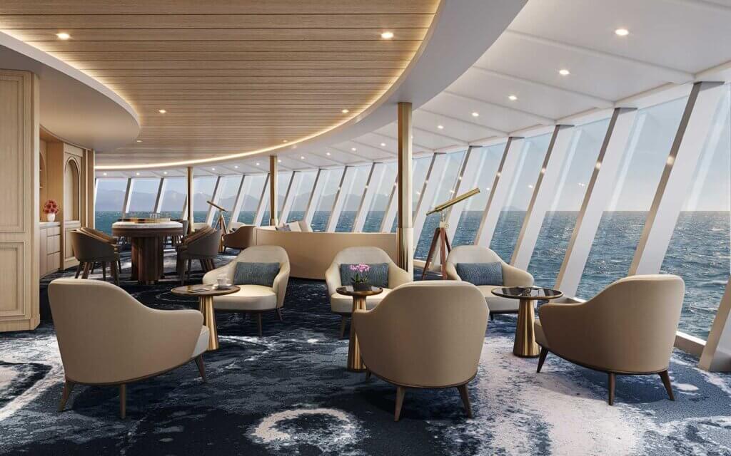
A key challenge for designers, particularly those operating in the cruise industry, is to ensure space is used as effectively as possible. Given the increasing number of guests sailing and the limited amount of space, designers must work to maximise each area of the room while maintaining a delicate balance and connection between each object featured.
Be wary of overcrowding spaces with too much furniture or an excess of objects, as this could leave guests feeling boxed in. However, it’s important that spaces don’t feel baron. This is especially given with the increasing incline towards interiors that feel like a home away from home. On cruise ships, it’s important that spaces not only serve the purpose of creating a cohesive interior but also contribute towards effective passenger flow.
In addition to this, to maximise the limited space on board cruise ships, multipurpose spaces are now on the rise within cruise design. These flexible interiors serve as the backdrop for various functions and activities throughout the day. As such, they must feature simple designs can which transform and adapt to host many functions suiting different passengers throughout the cruise.
“Interior design plays a huge part in passenger flow.”
Ann Bada Crema, CEO, Launch by Design

Color
One of the more commonly acknowledged aspects of interior design psychology, at least in the commercial market, is color. Carefully selected by the interior designer (in collaboration with the cruise line or shipowner, of course), color palettes can make or break a guest experience.
- Neutral color palettes can offer a sense of grounded-ness and stability, as well as contributing to more ‘organic’ interiors. Beware though, a monochromatic color palette could leave guests feeling lacklustre and sleepy. Best featured: In a suite, cabin or spa.

- White spaces induce a feeling of cleanliness and freshness. Tread carefully though, too much white could leave a room feeling sterile and clinical. Best featured: In small rooms you want to make feel larger.
- Red is the color of love and passion, but did you know it can also boost metabolism and blood pressure? Best featured: As an accent color in restaurants and bars.

- The slightly subdued little sister to red, pink evokes happiness and peace and is a much more calming tone. Considered a factor in appetite suppression, avoid pink when designing dining spaces. Best featured: In public spaces and children’s areas.
- A well-loved color in the cruise industry, blue is one of the most versatile colors available. Light blues tend to encourage a sense of calm but be wary of dark blues which might make your guests feel gloomy. Best featured: In suites and spas.

Long ago purple was the color associated with royalty, and even now it contributes to feelings of luxury, creativity, and wealth. Bold colors like purple should be avoided in high quantities as, similarly to dark blue, it could leave your guests feeling down in the dumps. Best featured: In entertainment spaces.
“There are psychological elements you can use to help people leave [or stay in] a space.”
Elizabeth Overland, senior interior operations specialist, Holland America Group
Light
Bold, bright, and beautiful or light, airy, and spacious: natural or artificial, lighting allows designers to foster the ideal setting for cruise guests. Generally, designers favour natural light as it can boost feelings of happiness, as well as making spaces feel larger. To create stunning light-filled spaces, designers can utilise glass panelling, something which isn’t always an option given the stringent weight restrictions on cruise ships.
Getting creative with lighting gives designers the opportunity to alter a guest’s emotional experience further. While dim lighting can create a sense of gloominess, it can also help foster a cosy environment and encourage guests to stay put, (which is why you’re most likely to find it in spas, bars, and restaurants). Meanwhile, bright lighting encourages movement, so will be found more frequently in fitness centres, lifts, and corridors.

“There are many elements in the design and in the layout that are able to influence the flow.”
Marco de Jorio, CEO, De Jorio Design International

Texture
The textures you surround yourself with impact your emotions almost as much as space and light do. While soft and silky textures can encourage intimacy and romance, raw, rugged textures contribute to organic, natural-looking interiors, in line with the trend of bringing the outdoors in.
Smooth textures can act almost as a blank canvas in our minds, often serving the purpose of showcasing the room’s other features or the products’ form and color. Used alone, however, smooth surfaces can be austere, leaving the room and guest wanting something more. In contrast, rough textures draw attention but can also serve as a distraction, so are best used sparingly. If you’re looking for something natural and strong, seek out hard textures to ground the room. As always, balance is key, especially when it comes to layering multiple textures.
Want more of this?
Check out the Cruise Ship Interiors Design Expo Americas blog for more design insights and the latest industry updates. CSI Design Expo Americas is the world’s only exhibition and conference exclusively dedicated to connecting the buyers and suppliers of the cruise design industry. Find out more about the next event here.